Firefox 4.0 Beta (4.0b10) Review
That’s 4.0 beta 10 to be exact. Mozzilla has been steadily releasing beta versions of their very popular (and now highly anticipated) Firefox browser. Fitting the stereotype of a tech geek, I had to see what all the fuss was about. I do have to admit, while I have had a version of Firefox in one form or another installed on my mac for almost as many years as it’s been in existence, I was a hold out from making the complete switch for some time. Don’t get me wrong, I’ve surfed around with every major browser out there and then some. Partial to the mac platform, I always seemed to come back around to Safari. What happened? Well, as Firefox fox gained in popularity, more and more add-ons, and plugin-ins became available. Then there is the whole compatibility aspect. I’d often find bugs with Safari or other Webkit powered browsers and then when I switched to Firefox, the issue were often resolved. Now, to give credit where credit is deserved (or isn’t in this case). In many cases it wasn’t the browsers inability to render code, but the designer/developer’s buggy code.
Once the firebug and web developer add-ons were released, it was clear, there was simply no reason hold out. I simply can’t imagine doing any sort of development without those two tools now. The Delicious add-on was just icing on the cake. Also, I truly believe that the future of web browsing is in firefox. It’s lightyears ahead of Internet explorer (ok, almost every browser is). According to a number of sources, it is now the MOST popular browser available. Take a look at W3schools. Wiki states that more than 60% of Germans are surfing the web with firefox. Dig a little deeper on the WWW and you’ll most certainly get conflicting reports. Apparently in China, IE is the dominant player yet in Belarus and many surrounding Eastern European countries, Opera is the Heavyweight (weird?). Not really if you consider the fact it’s based in Norway I suppose. Either way, I wanted to check out 4.o for myself. Like many developers, Mozzilla puts out a whole series of releases, each one separated by a week or so. I downloaded an earlier release ( 4.0b7 I think) a while back. I took it for a short spin. Almost none of my add-ons were compatible and it created mass confusion having more than one firefox installs on my machine so my test period was short. to short for any formulated opinion.
So off I went to the Mozzila website to download the latest release…
Yes, Firefox, you can phone home:
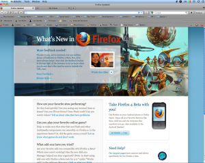
Installation went fine. Installation issues of any sort are very rare for me these days. After firing up firefox, I was met with the standard, “what’s new” with Firefox page.
This biggest change to the browser chrome is the new tab location. I’m a total tab junky. I force everything to open in a tab and often stretch the from one side to another. I Almost never more then one window though :). Mozzila says they changed the location to give them a more prominent space. I’m havn’t really made up my mind weather I like this or not. A couple things that do come to mind though… 1) I’ve been looking for my tabs bellow the bookmark menu for YEARS. There is is going to be a learning curve here. 2.) I’m not so sure that the new location is any more convenient. It’s actually further away from the page content. A small difference I know, but why fix what’s not broken?
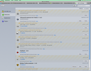
Checking in on the ad-ons manager, things are a little different this time:
Some of my more used add-ons are compatible but still a little way to go there. Certainly not going to go blind from small print either. I will say, in all regards, it’s highly intuitive to use and looks a whole lot better. In regards to general surfing speed, under very unscientific browsing activity it seemed quite snappy. If you’re a die hard performance stats geek, you can go out and test the various rending engines and algorithms and their millisecond differences in a number of places – cause I’m not.
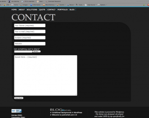
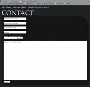
There is one very interesting change in regards to under the hood construction that I was interested to check out. Firefox will be moving to the JagerMonkey JavaScript engine. This is a welcoming change and highly anticipated as firefox has lost significant ground in terms of JavaScript rending speed. I set out to give it a test run and I found one very interesting change. Firefox 4.0 allows you to change the size of any text input form. check out a before and after screen shot from this very site.
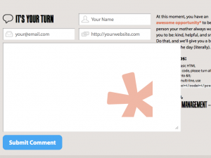
Notice the little grippy-grabby widget in the bottom right of the text input field. Pretty cool right? Ya not bad. HOWEVER! As a designer, I could immediately think of some situation where this if going to create issues for me ( and others ). Didn’t take long for me to track down a few examples. Take a look at what happens to this for when you enlarge it.
Good-bye border! Still totally functional (except for the fact that it clips the text too) but enough to make any designer cringe. Another example from a very popular design community CSS-Tricks:
In this example, the background image in the text field is clearly not meant to be display like this and the field stretches over page content. Again, not a huge issue, but just another thing thing to be aware of when designing and coding.
Some other highlights are:
– CSS Transition – (awesome!) Any sort of animation via CSS/javascript is a step in the right direction (in my opinion).
– CSS touch properties
– Forms in HTML5
– HTML5 Sections
– Support for WebM video
– WebGL
The final Firefox 4.0 is planned for a late February arrival, assuming there won’t be any major bugs to slow down its developers.

